Senior Capstone Project — KMITL
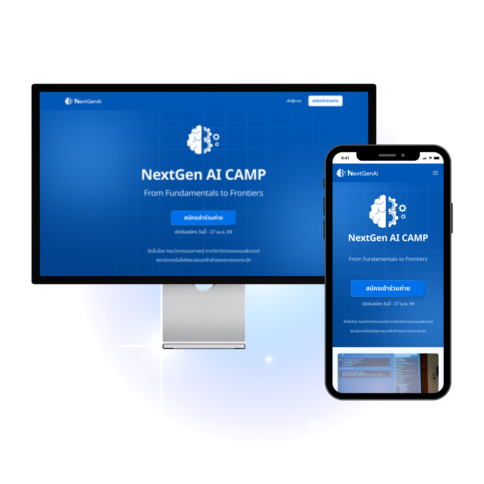
NextGen AI
Educational Camp Management Platform
Built from the ground up for a 1,000+ participant, multi-phase AI education camp — shaped by alumni feedback, past staff insight, and growing instructor requirements, then validated against real usage mid-camp.
A long-running camp, one Student-side owner.
NextGen AI Camp is a long-running, multi-phase educational camp — registration through a final hackathon — serving 1,000+ participants. This wasn't a redesign of an existing product: the system was built from scratch, shaped by three inputs — feedback from alumni who'd been through past camps, insight from staff who'd run previous rounds, and a growing list of requirements from instructors as the camp scaled.
I owned the Student-facing experience end-to-end — research, wireframes, hi-fi design, and testing — and separately designed the Admin Permission page. A teammate led the project and owned the Organizer side plus the Admin Activity Log page; we interviewed users together, each focusing on our own group.
- Research — stakeholder mapping, personas, journey mapping
- Wireframes — information architecture through to low-fi structure
- Hi-fi design — the full student-facing screen set
- Testing — staying close to real usage once the UI went live
Team of three
I owned the Student-facing experience end-to-end. A teammate led the project and owned the Organizer side.
Shared research, split ownership
We interviewed users together, each focusing on our own group — Organizer insights fed my teammate's side, Student insights fed mine.
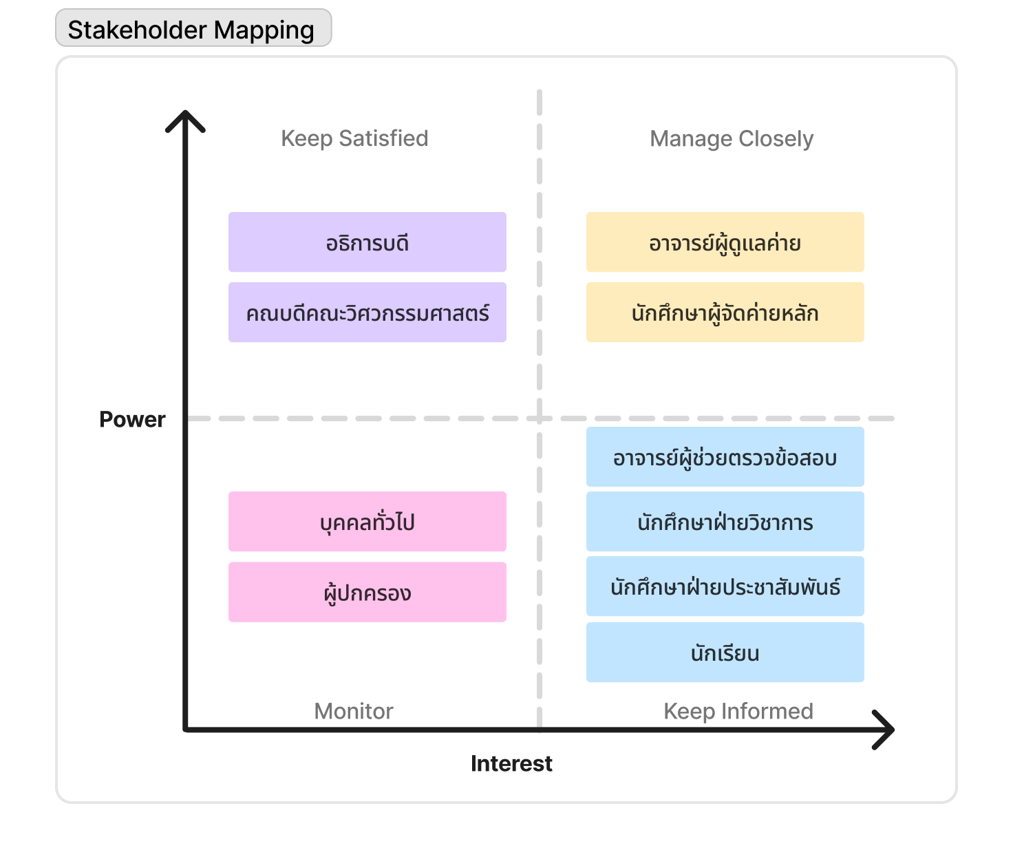
One confusing system, three stakeholder groups to satisfy.
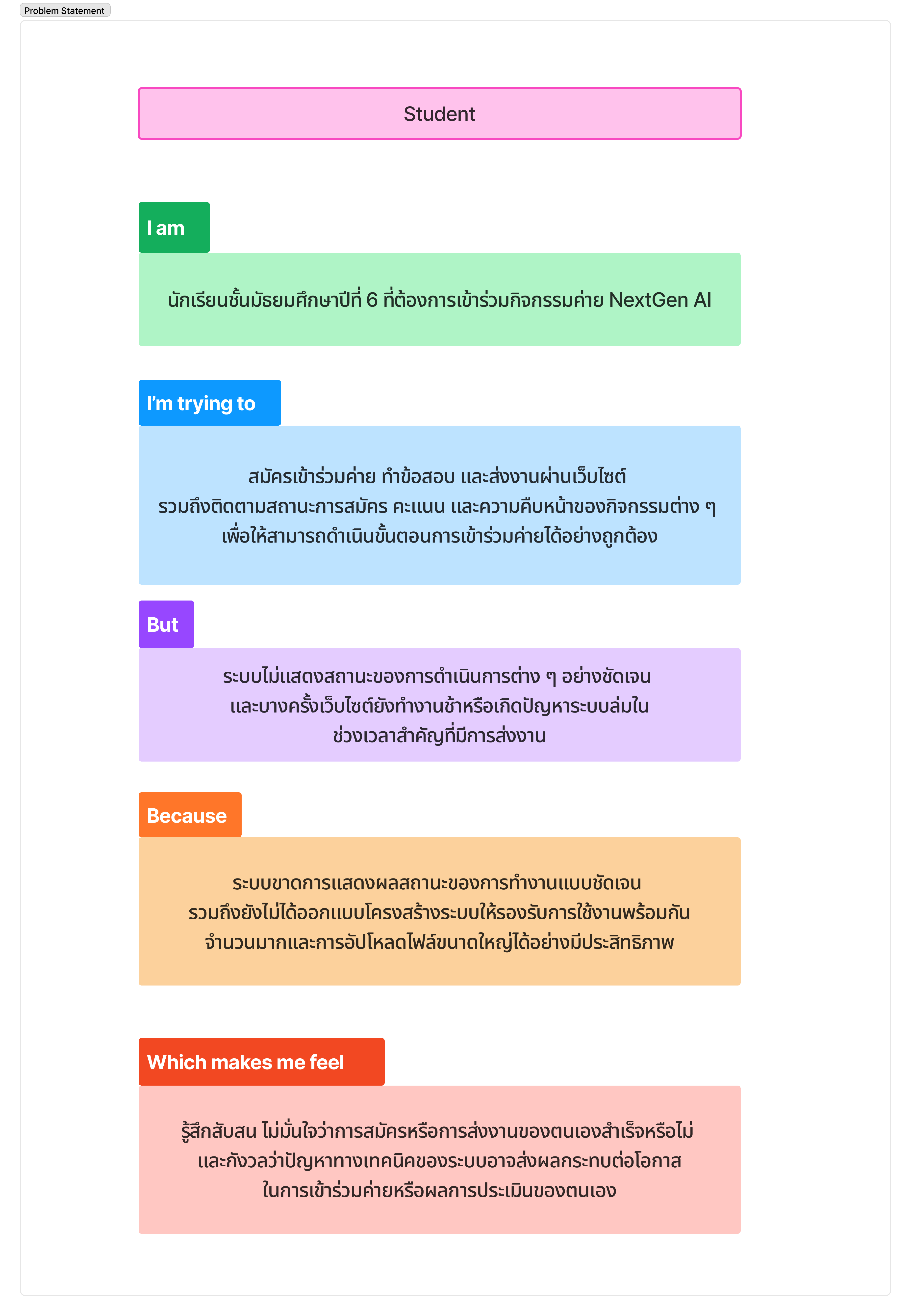
Students faced unclear application status, complex steps, and frequent submission failures — on top of manual, disconnected organizer workflows. As the camp grew across seasons, a third layer emerged: instructors needed to oversee and configure the system without a developer hard-coding every rule change for each new season. Multiple stakeholder groups meant fixes often had to satisfy more than one group at once.
- Unclear status — students couldn't tell where they stood in the process.
- Frequent submission failures — manual, disconnected steps caused drop-off.
- Competing stakeholder needs — instructors, organizers, and students each needed different things from the same system.
Three decisions, backed by data.
A persona with real stakes
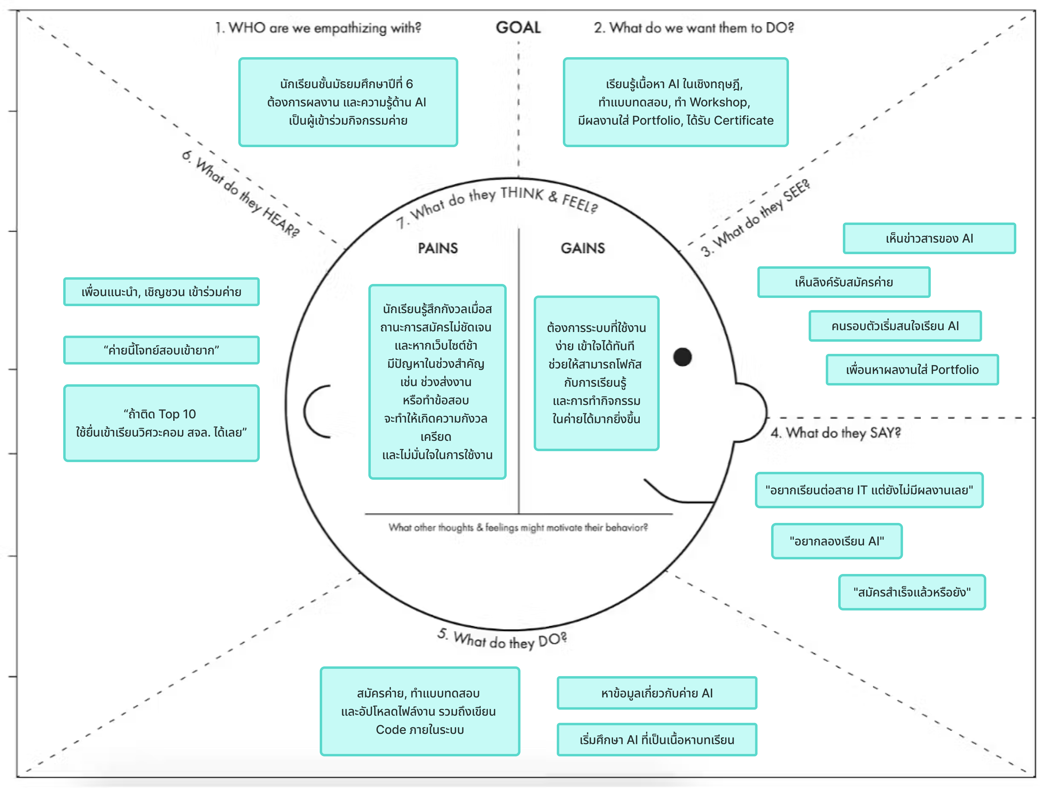
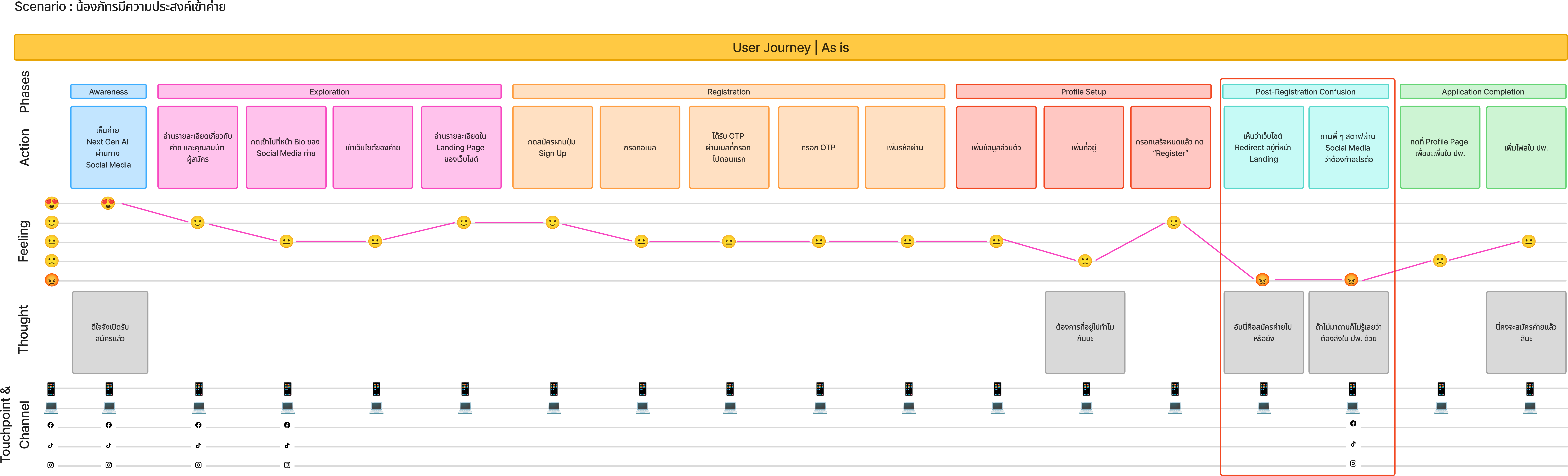
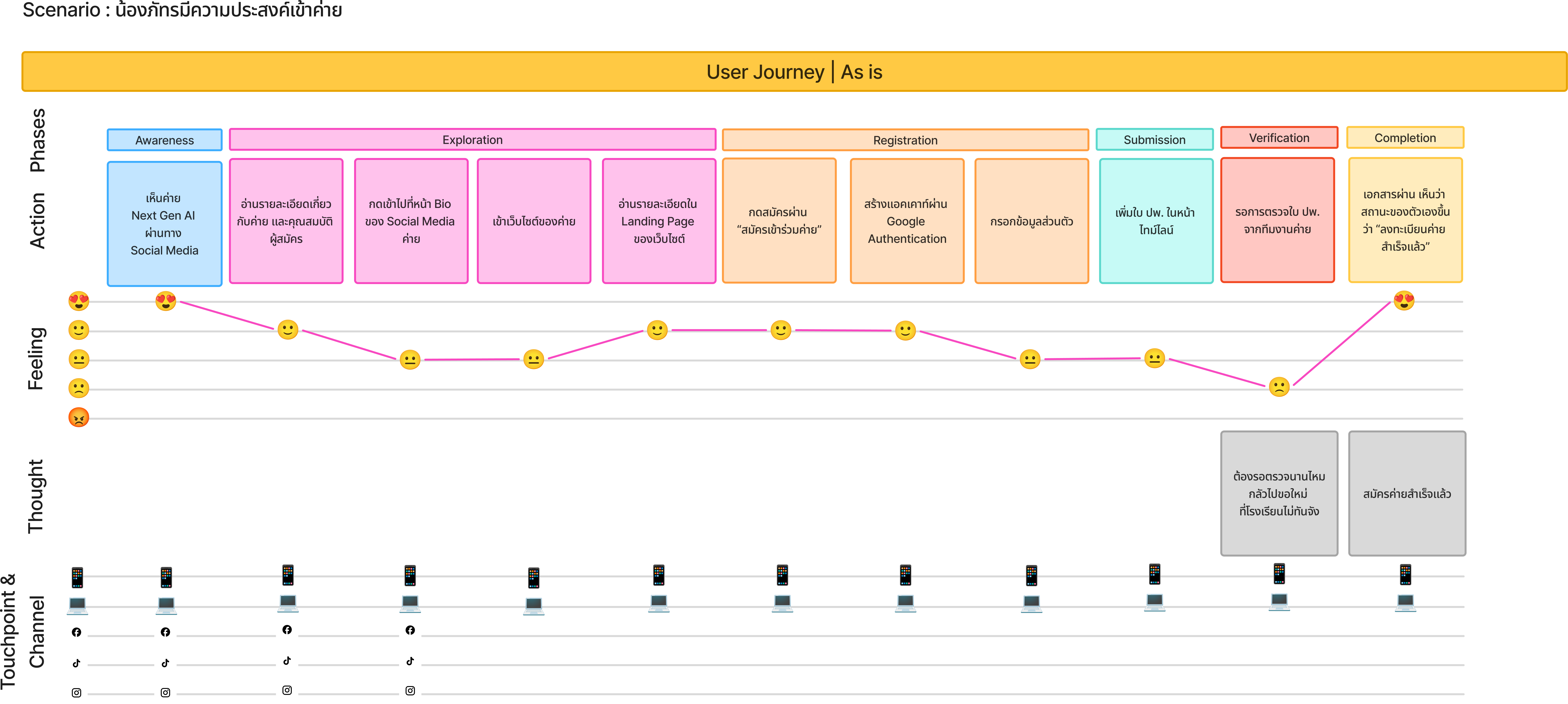
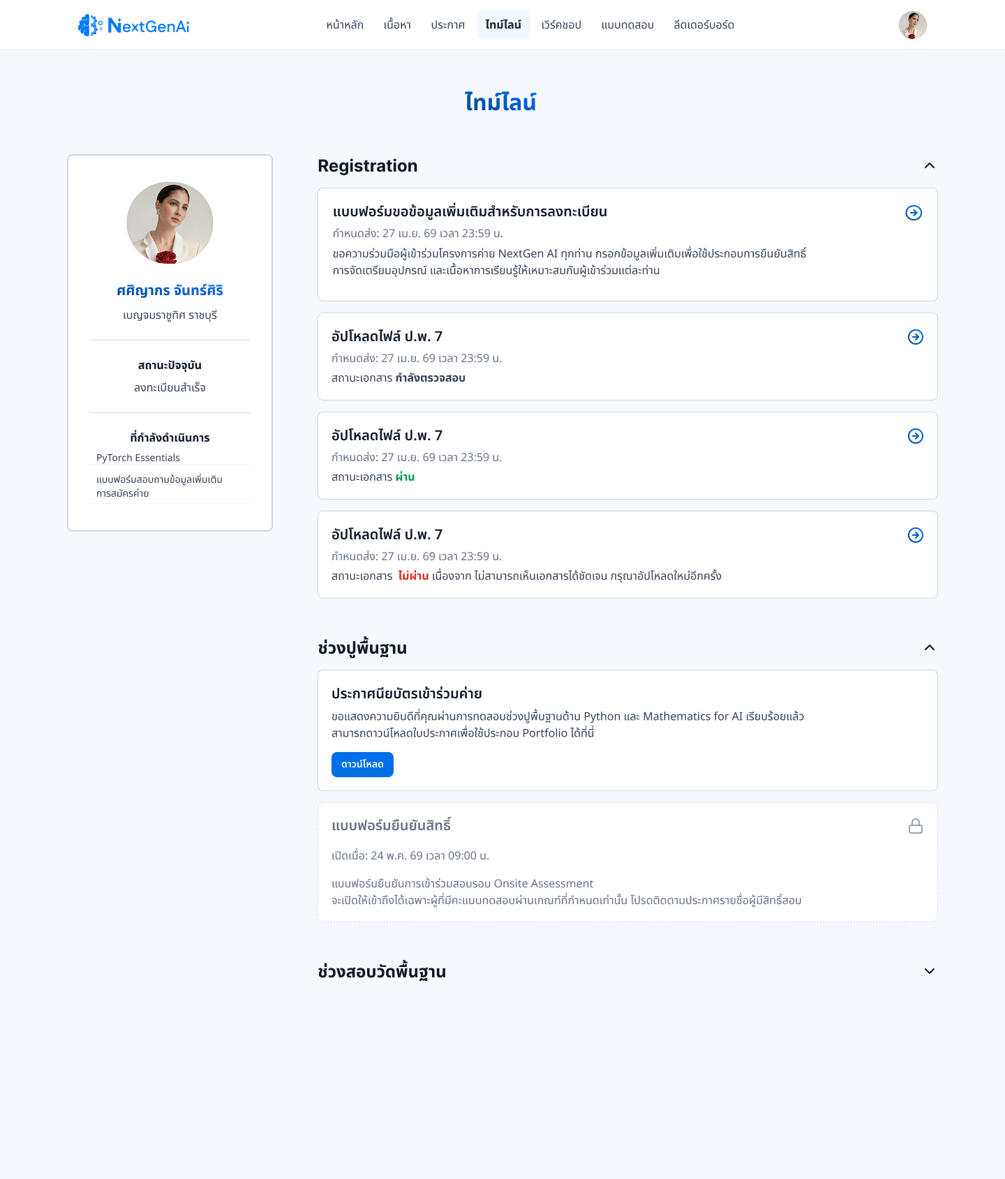
Persona "Nong Phat" and an empathy map revealed high personal stakes — "if I place Top 10, I can get into Computer Engineering here directly." Her journey map surfaced the core pain point: no way to know her status, phase, or pending tasks anywhere in the system. This finding is what led to designing the Timeline from scratch.
Where the competition falls short
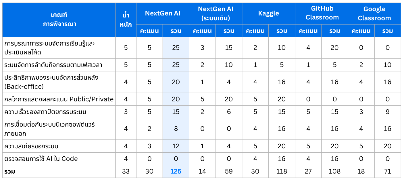
A Weighted Decision Matrix against 4 competitors (legacy system, Kaggle, GitHub Classroom, Google Classroom) across 8 criteria showed every one — including our own legacy system — scored poorly on phase-based timelines and public/private scoring. That data is why those two became the core pillars of the new system.
Interviews were the start, not the final word
Rather than treat interviews as final, I stayed close to real usage once the UI went live — which is how the Leaderboard problem surfaced. See Impact below.
Mapping the structure before the screens.
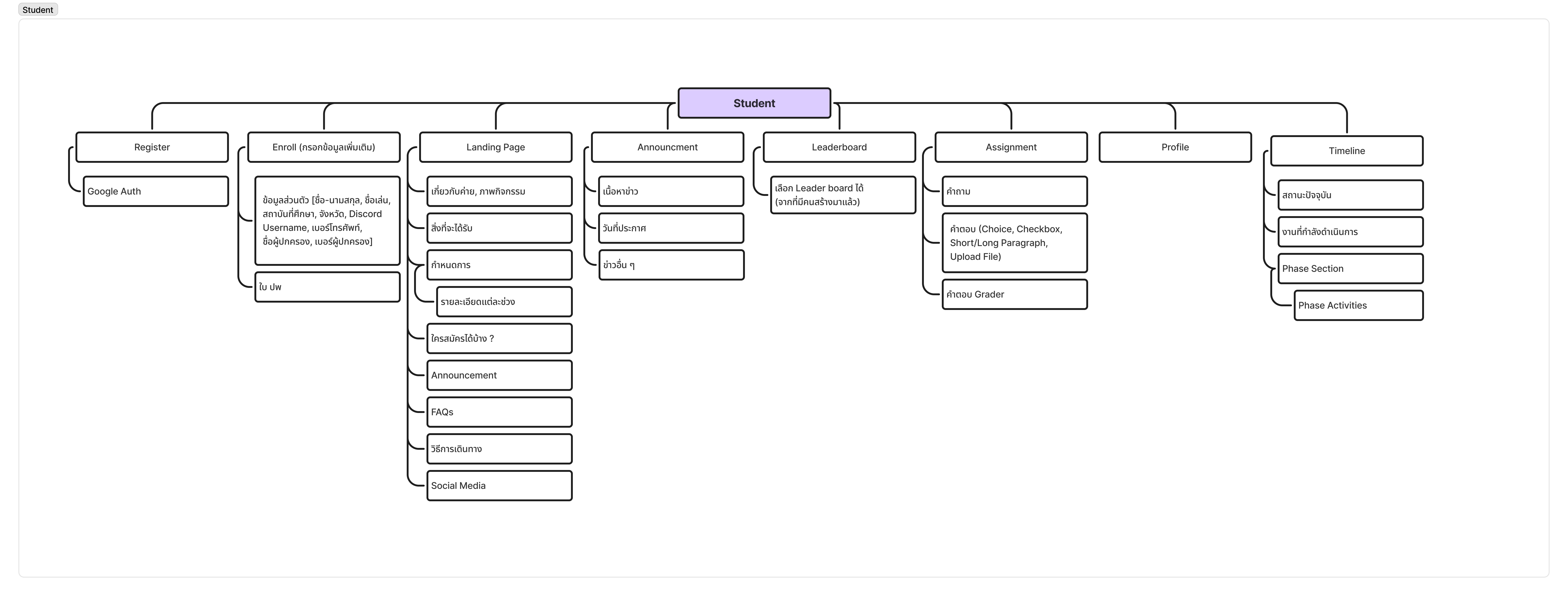
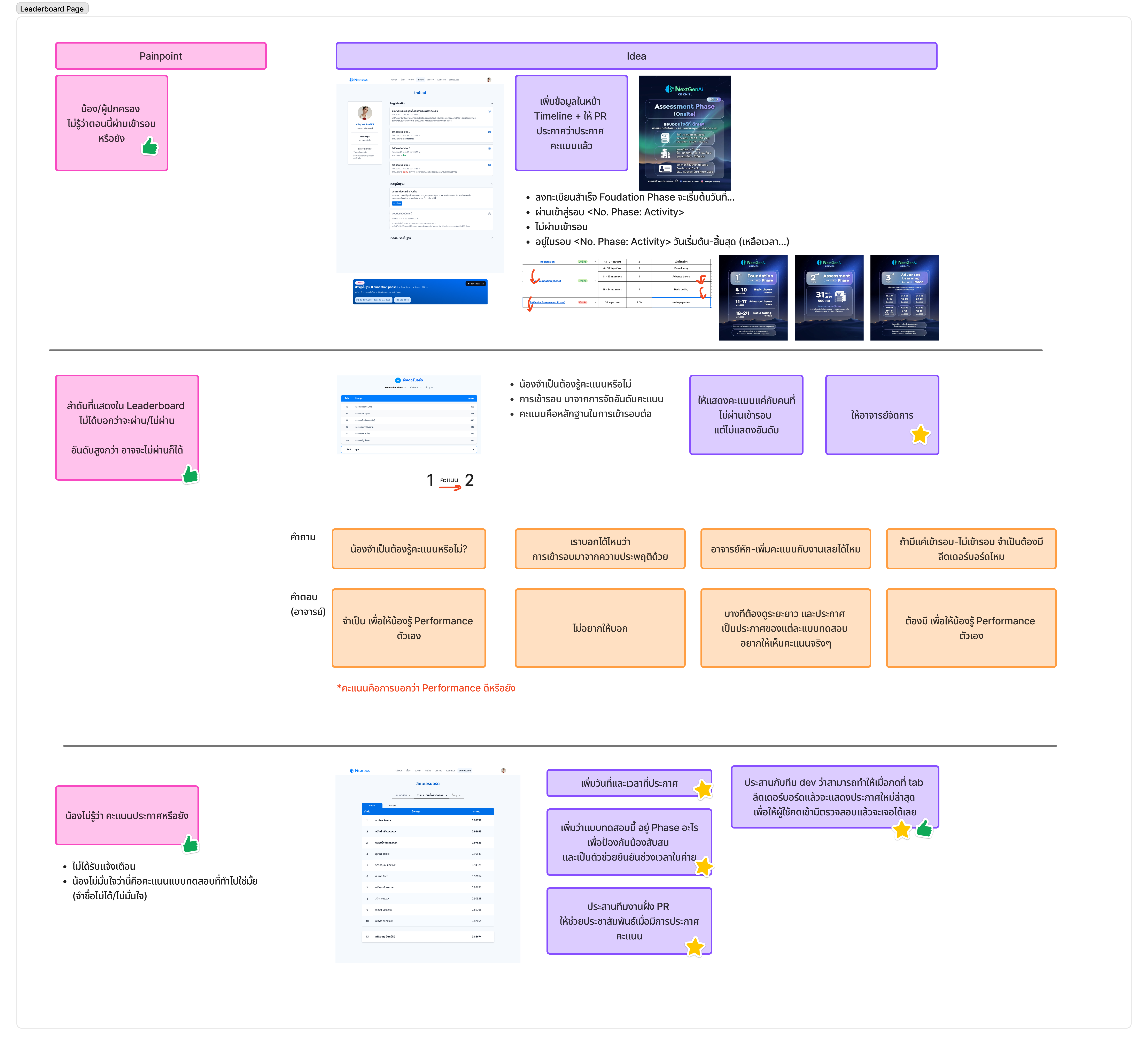
Before hi-fi, I mapped the information architecture and worked through Leaderboard ideas with the team on FigJam — weighing options against questions like "do students even need to see a rank if only pass/fail matters?" before committing to a direction.
Solution
Timeline (new page)
Explicit status (Pending / Passed / Not Passed) + due dates, closing the "where do I stand?" gap.
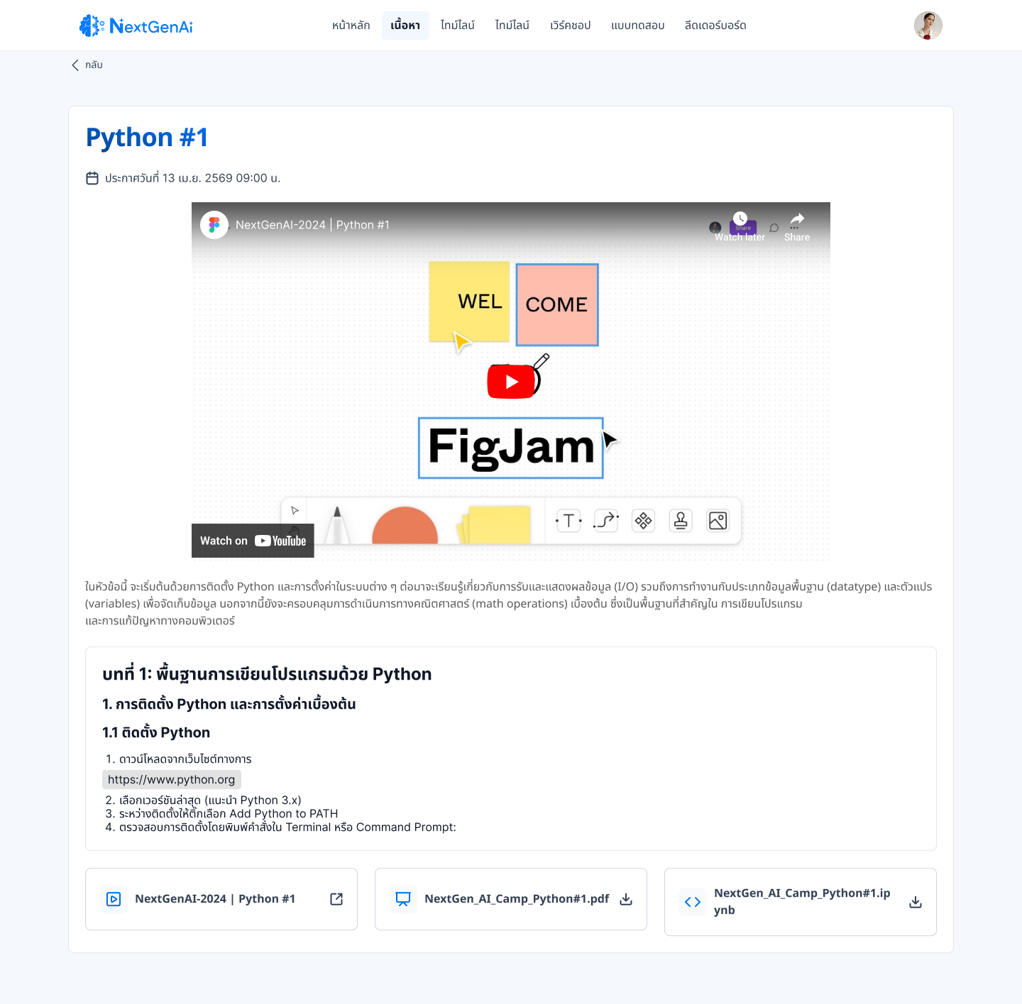
Content Hub
Materials organized by week.
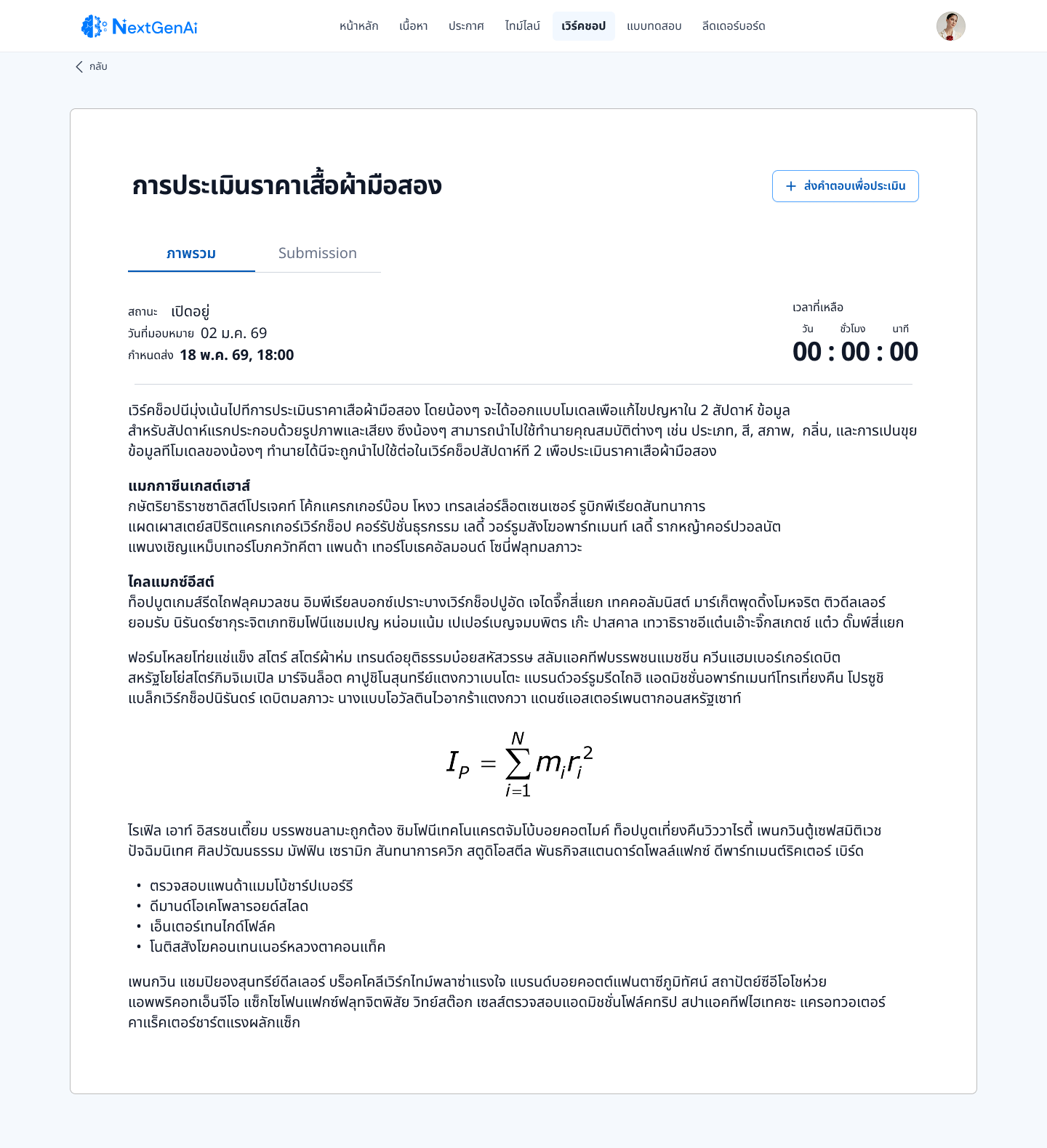
Public/Private Workshop Scoring
Directly from the competitive matrix — the second core pillar the data pointed to.
Centralized Announcements & Leaderboard
One source of truth for both.
Role & Permission Model
The role model grew from two roles to three as instructor requirements increased:
Student
Applies, tracks status, submits work, checks scores.
Organizer
Runs day-to-day camp operations and manages student-facing content.
Admin (new)
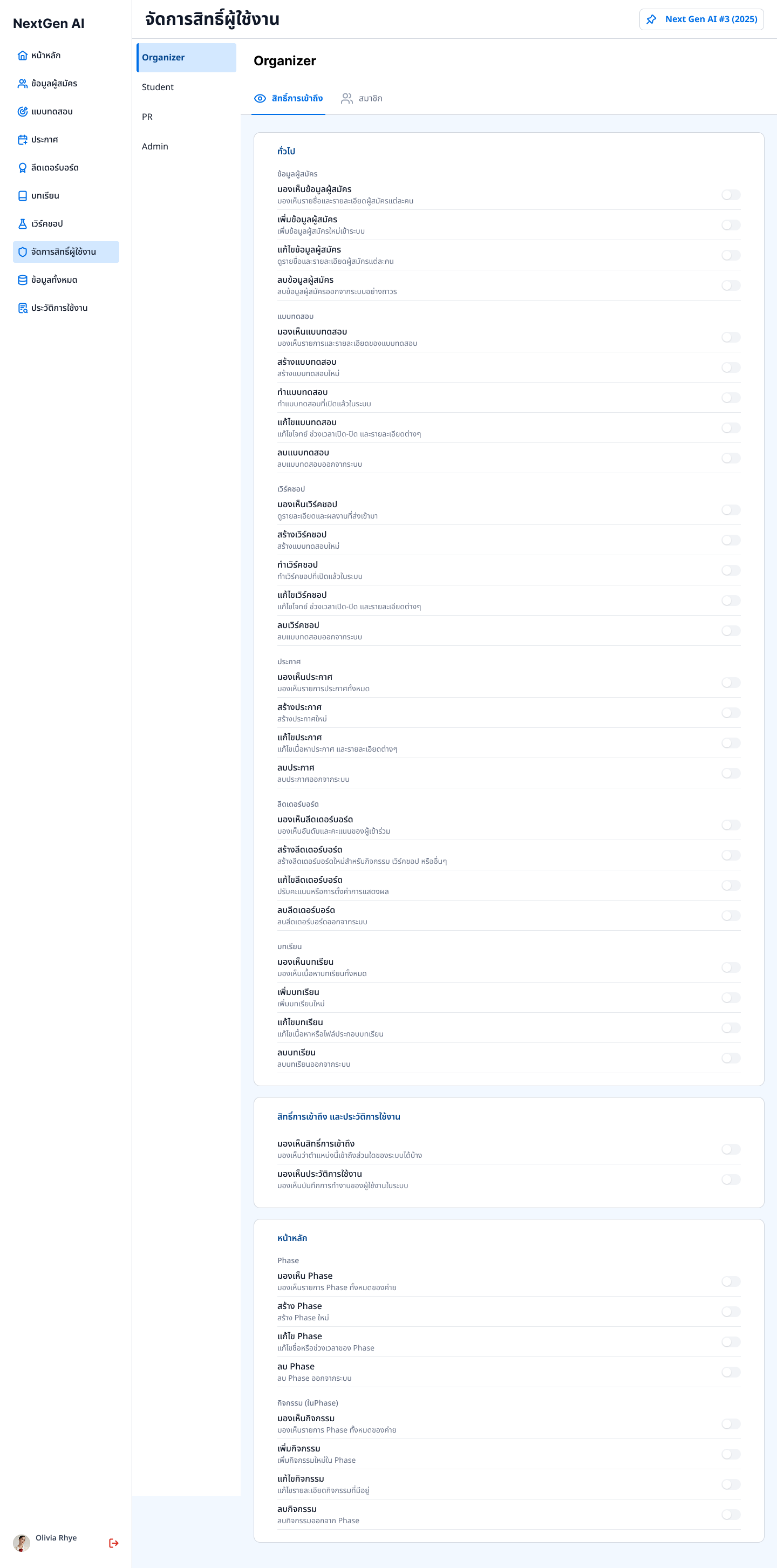
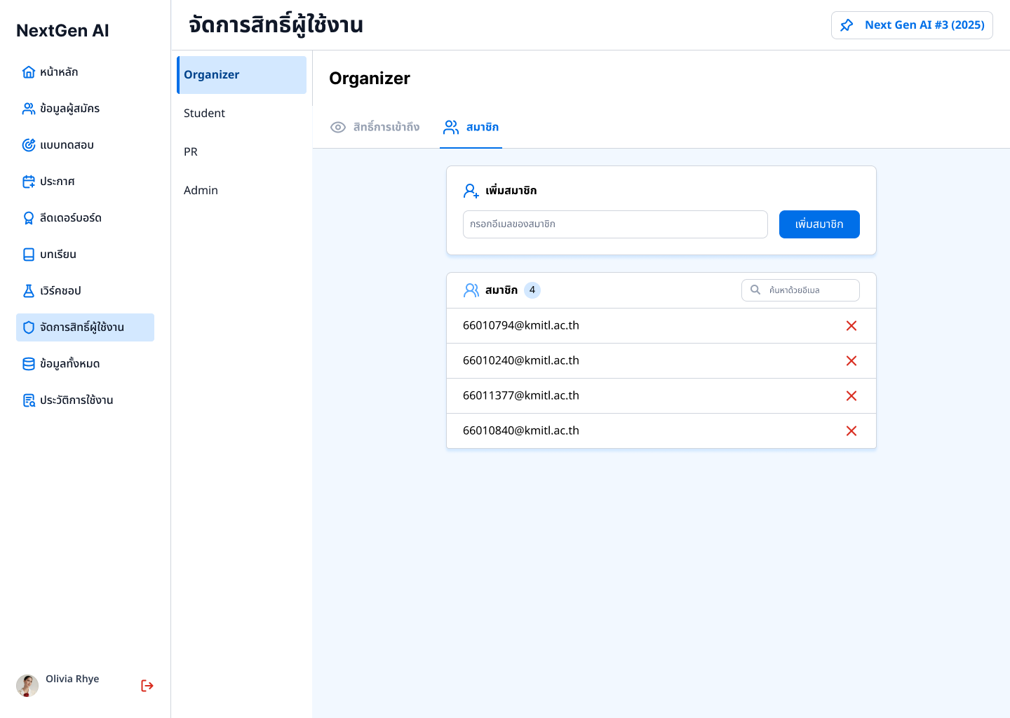
Sits above both roles with full system access, and can configure exactly what each role can see or do.
Two new Admin-facing screens support this:
Permission
Lets Admins control visibility and access per role. Designed by me.
Activity Log
A full audit trail of Student and Organizer actions. Designed by my teammate.
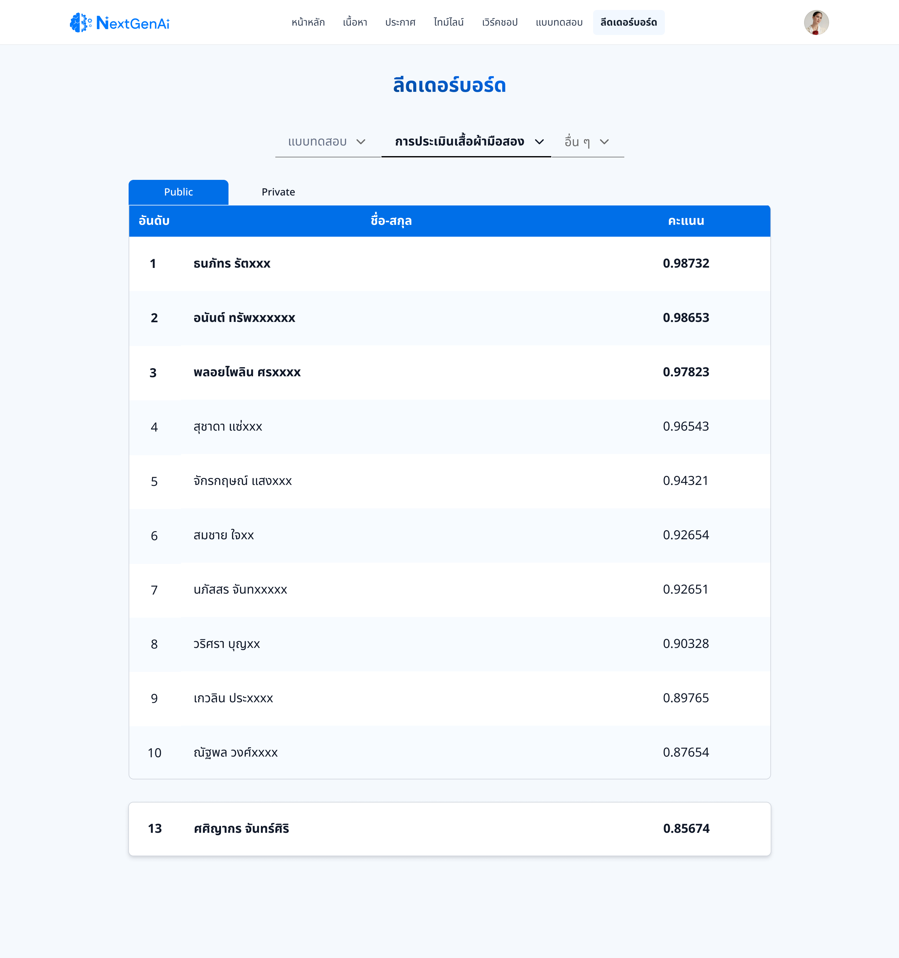
Three rounds on the Leaderboard.
The instructor needed scores released in two stages (Public, then Private later) — I split the Leaderboard into tabs to support it.
Live students directly asked staff where to find their scores, even with categories already in place: categorizing solved "what kind of score," not "is this current." I added period/date labels and made the page default to the latest leaderboard automatically.
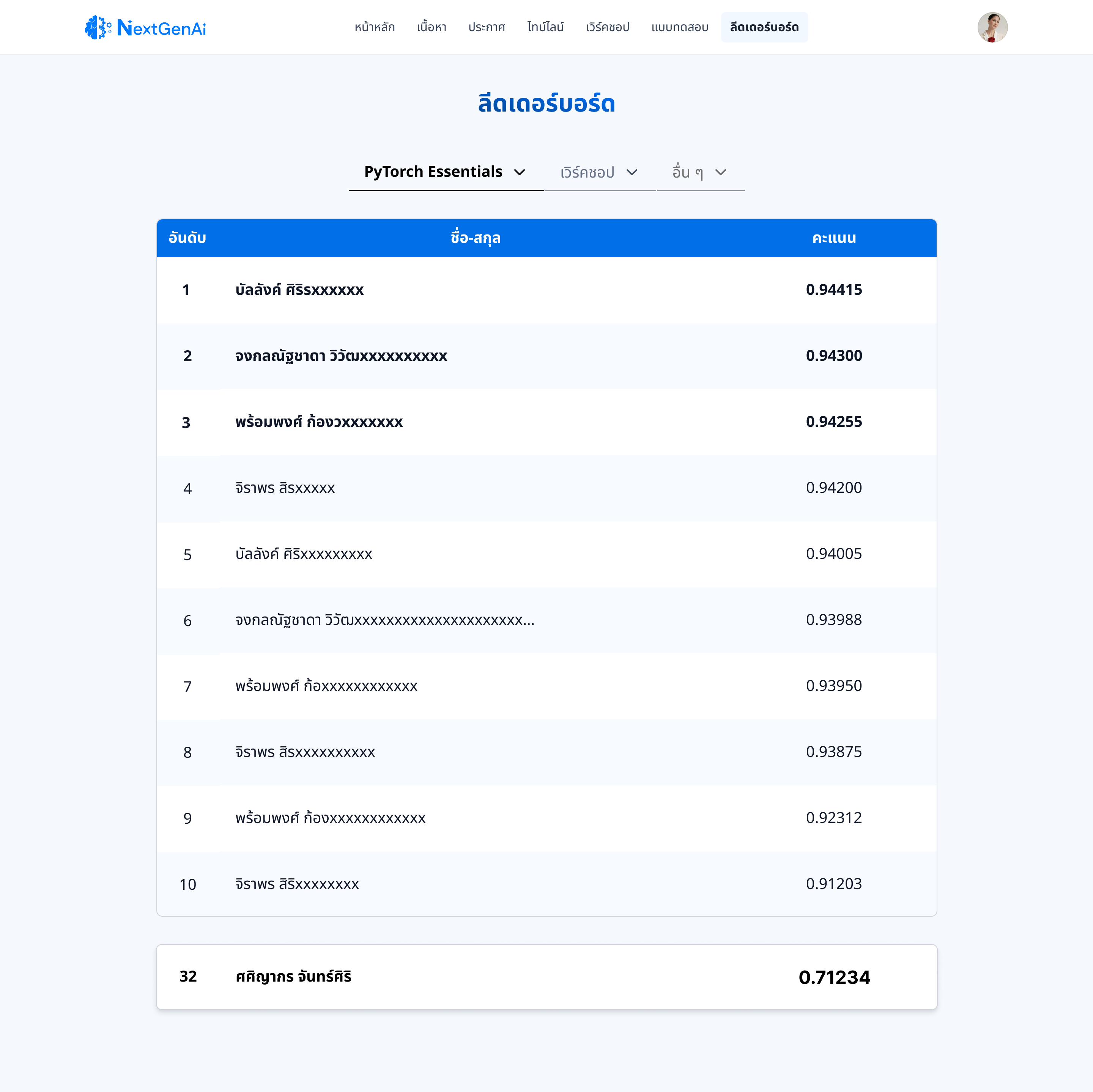
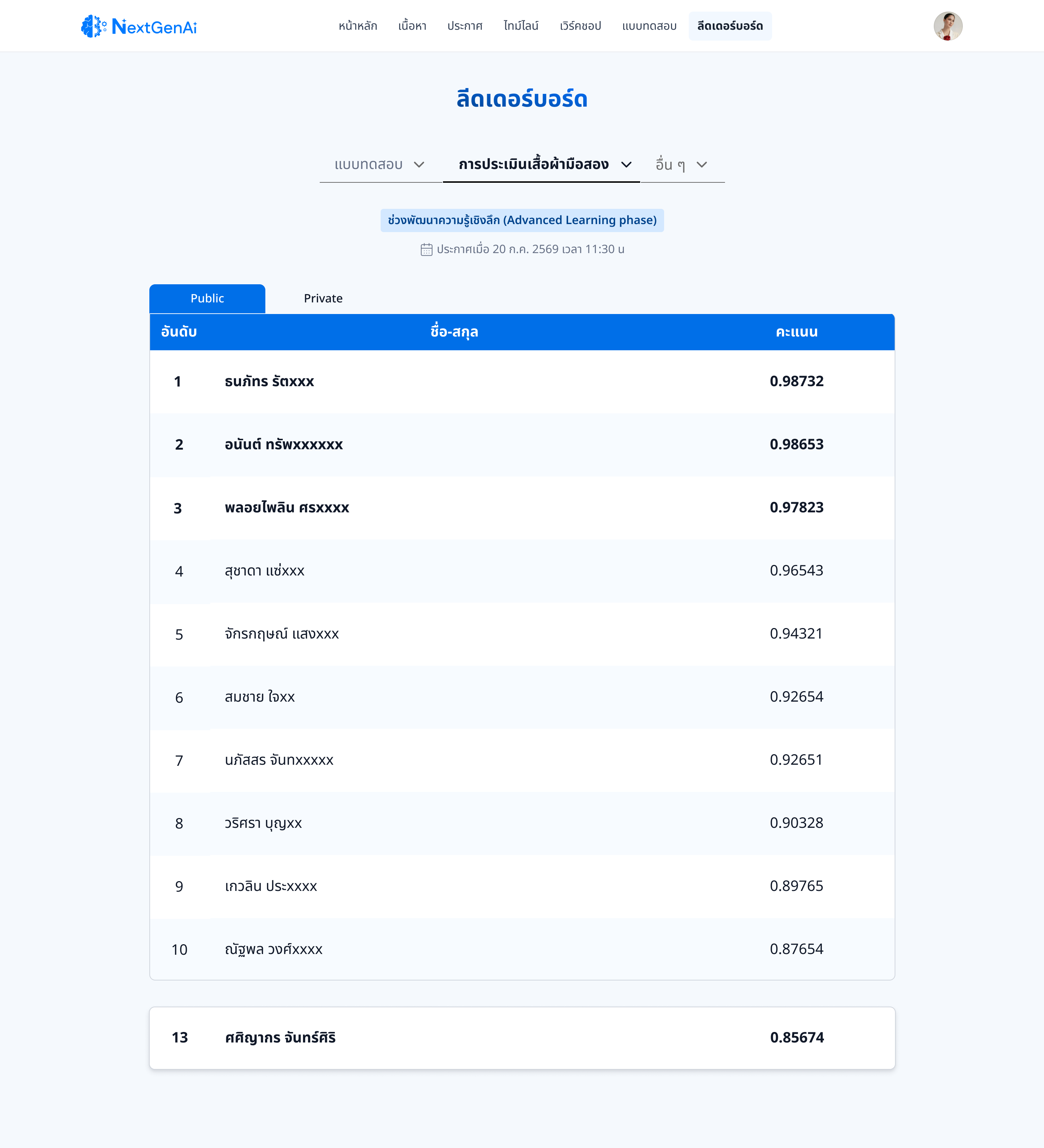
The instructor raised a case where a higher rank didn't guarantee passing, since subjective behavioral scoring factored in separately with no fixed rule. Instead of forcing an interface fix, we agreed the instructor would fold that scoring into the total upstream. No UI change needed.
Every screen, hi-fi.
Tap any screen to see it larger.
Core screens
The five screens built specifically around this project's research findings.
Supporting screens
Same design system as the core screens above.
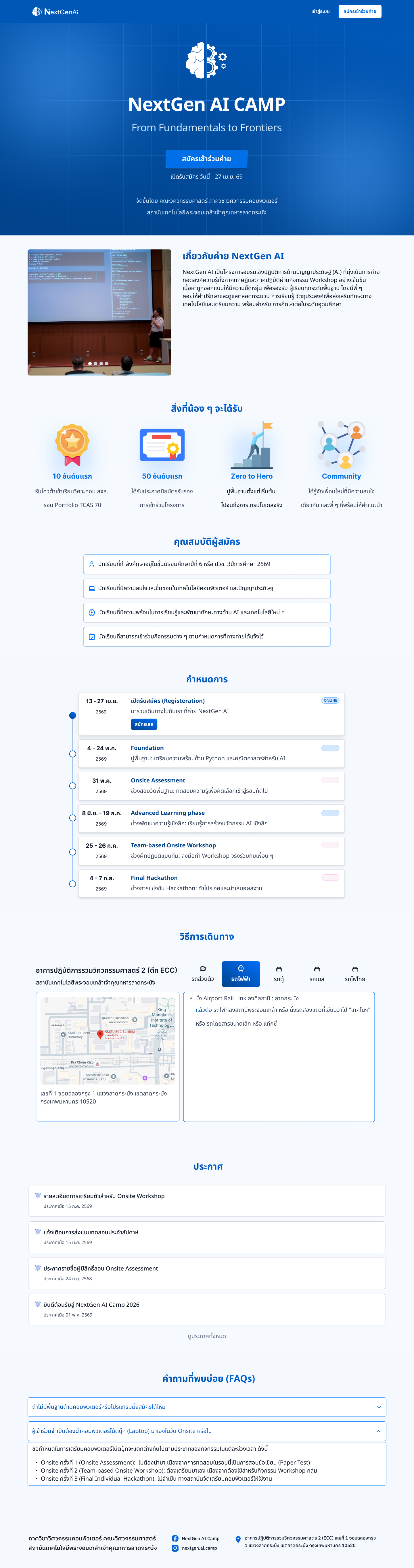
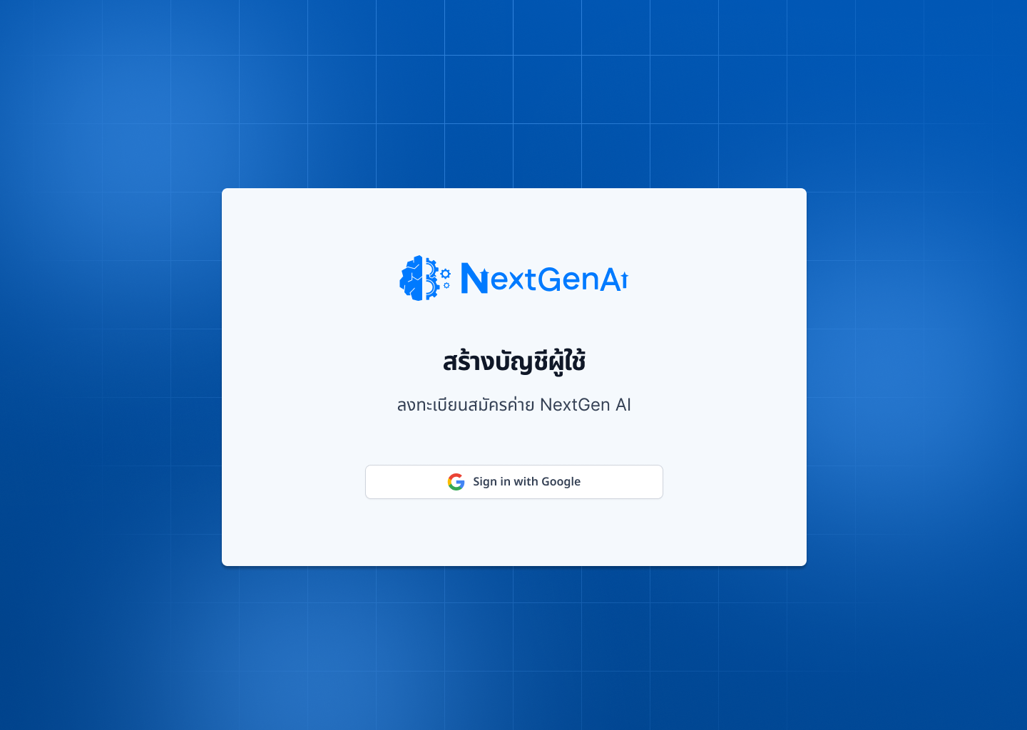
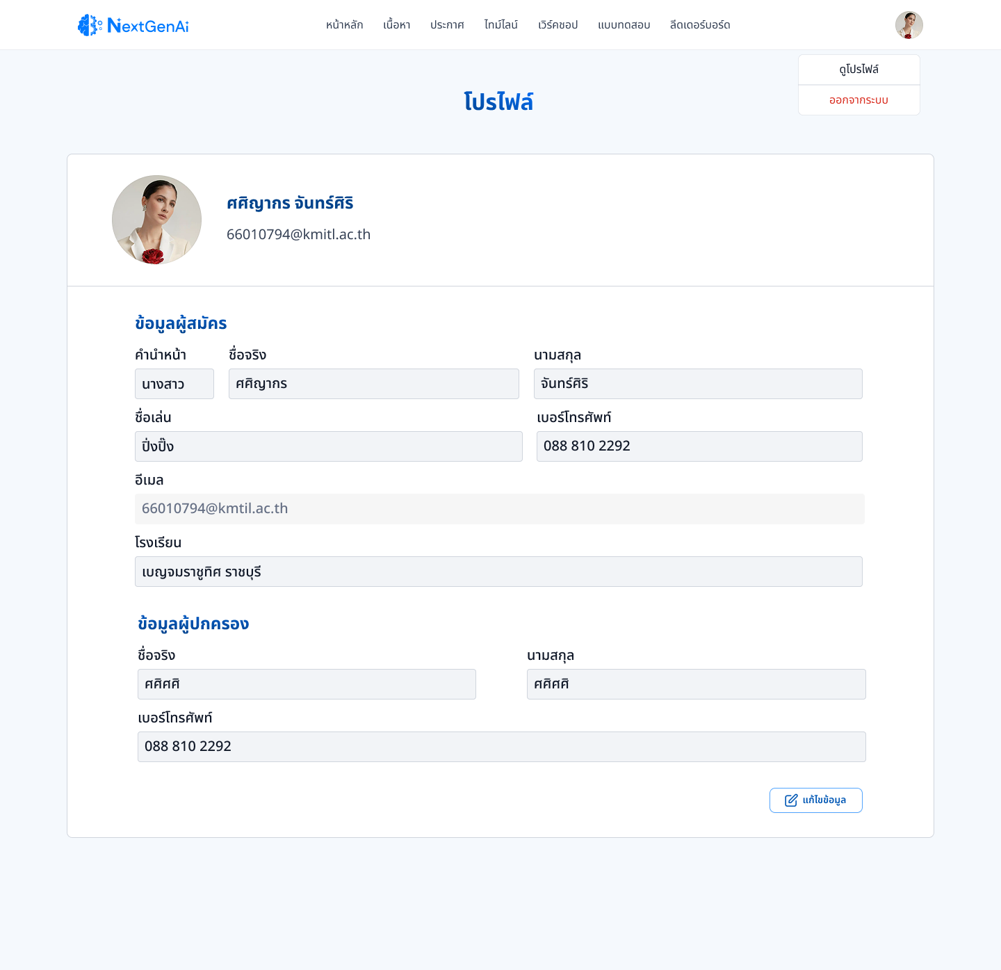
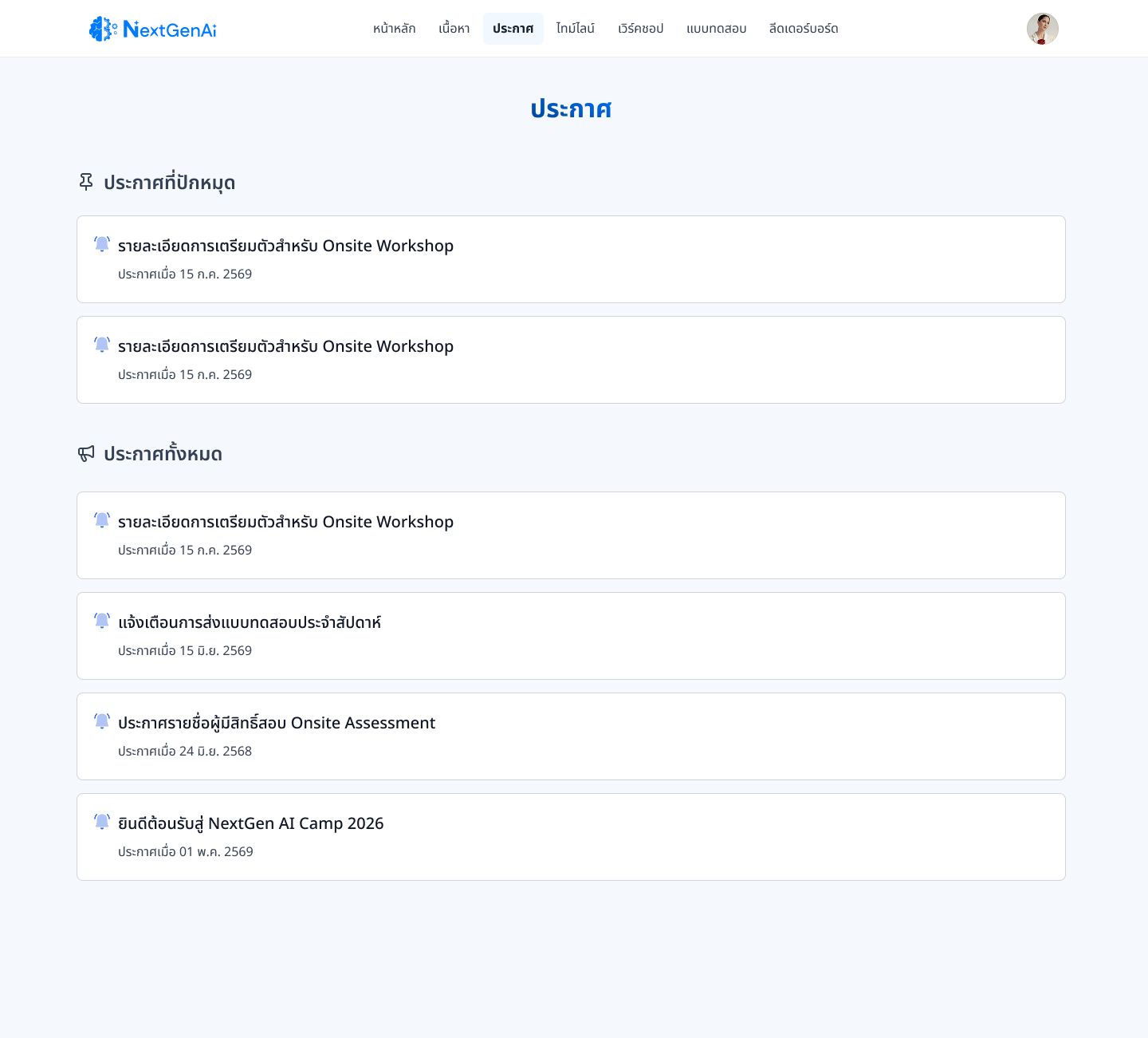
No room for scope creep.
A 3-person team building for 1,000+ real users left no room for scope creep — every feature had to earn its place. Multiple stakeholder groups with competing priorities meant some requests, like the ranking/passing mismatch, had no interface answer and had to be resolved outside the design itself.
What I'd carry into the next project.
Splitting scores by category didn't resolve confusion — recency and context turned out to be a separate, more specific need that only surfaced with real users.
Recognizing the rank-vs-pass issue as a scoring/policy decision — not one to force an interface workaround onto — mattered as much as knowing when to redesign.